

 HaZeM Design team

Getting visitors to your store is hard work: ads, influencers, content, SEO. Losing them at the product page or checkout is painful. Good e-commerce UX in the Gulf is about removing every unnecessary doubt and step between “I like this” and “Order confirmed”. This guide covers the details that matter most to shoppers in Kuwait, Saudi Arabia, the UAE, Qatar, Bahrain and Oman.
Understand How Gulf Customers Shop
Every market is different, but some patterns are common in the region:
- Mobile first. Most store visits come from phones, often via social media links.
- Trust matters. Shoppers want to feel sure the store is real, the product is genuine, and delivery will arrive on time.
- Questions before buying. Many customers like to ask a quick question on WhatsApp before ordering.
- Fast delivery expectations. Same-day or next-day delivery is common in Kuwait and is often a deciding factor.
- Local payment habits. KNET in Kuwait, mada in Saudi Arabia, cards and digital wallets such as Apple Pay across the GCC, and cash on delivery for some customers.
- Bilingual audiences. Arabic and English shoppers both expect a natural experience.
The Homepage: Orientation in Seconds
Your homepage should answer three questions instantly: what do you sell, why buy from you, and where should I start?
- A clear hero banner with one main message and a CTA, such as “Shop new arrivals”.
- Visible categories with images.
- Best sellers or featured products.
- Trust signals: delivery promise, secure payment icons, exchange policy, reviews.
- A visible search bar for stores with more than a few dozen products.
Avoid heavy sliders that rotate five messages nobody reads.
Category Pages: Help People Narrow Down
- Use clear category names customers understand, in both languages.
- Offer filters that matter in your niche: size, colour, price, brand, scent family, occasion.
- Show key information on product cards: image, name, price, and stock or sale badges.
- Make sorting easy: newest, price, best selling.
- Use pagination or “load more” to keep pages fast.
Product Pages: Where Decisions Happen

The product page is your digital salesperson. Make sure it includes:
High-quality images
Several angles, zoom, and context images. For fashion, show fit and fabric detail; for perfume or cosmetics, show size and packaging. Consistent backgrounds make the store look professional.
Clear price and options
Price, any discount, and variant selection (size, colour, volume) should be visible near the top on mobile. If a variant is out of stock, show it clearly rather than letting people discover it at checkout.
Delivery and returns near the button
Right below “Add to cart”, show: estimated delivery time, delivery fee or free delivery threshold, and a short note about exchange or returns. This answers the questions that cause hesitation.
Useful description
Short, benefit-first copy, followed by details: materials, dimensions, ingredients, care instructions, and usage tips. Use bullet points for scanning.
Social proof
Genuine reviews, ratings, and customer photos where possible. Never fabricate reviews.
A WhatsApp shortcut
A small “Ask about this product” button that opens WhatsApp with the product name pre-filled can save sales from customers who just need one answer.
Want an easy interface and a user experience that turns visitors into customers?
The Cart: Keep Momentum
- Show a clear summary with images, quantities, and prices.
- Allow easy quantity changes and removals.
- Display delivery fees early, or a message like “Add 5 KWD more for free delivery”.
- Keep the checkout button prominent.
- Avoid surprises: hidden fees at the last step are a major reason for abandoned carts.
Checkout: Short, Local, Reassuring
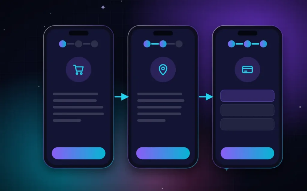
Checkout is where most stores lose people. Focus on:
Guest checkout
Do not force account creation. Offer optional registration after the order.
Local address fields
For Kuwait, use fields that match how addresses work: governorate or area, block, street, avenue (jadda), house or building, floor, and apartment, plus optional extra directions. For Saudi Arabia and other GCC countries, adapt to their formats, such as city and district. Correct address fields reduce delivery problems and calls.
Phone number first
Delivery drivers rely on the phone number. Validate the format and set the country code automatically when possible.
Delivery options and time slots
If you offer same-day, next-day, or scheduled delivery, show the options clearly with prices and cut-off times.
Payment methods customers expect
Show recognisable payment options: KNET, cards, Apple Pay where available, and cash on delivery if you offer it. Display payment logos and a short security note.
Clear confirmation
After payment, show an order summary, expected delivery time, and how to contact you. Send confirmation by email and, ideally, WhatsApp or SMS.
Arabic and Bilingual Store UX
- Ensure the full journey works in Arabic: product filters, cart messages, checkout errors, and emails.
- Mirror navigation and carousels correctly for RTL.
- Keep prices and phone numbers readable and consistent.
- Translate product names thoughtfully; sometimes brand names should stay in English.
Speed and Mobile Usability
A store with large images and many apps can become slow quickly. Optimise images, use good hosting, and test the mobile journey from Instagram link to payment. For more, see mobile-first website design.
Post-Purchase Experience
UX does not end at payment:
- Send delivery updates.
- Make exchanges easy to request.
- Ask for a review a few days after delivery.
- Offer a reason to come back, such as a thank-you discount for the next order.
Quick Checklist for Your Store
- Clear homepage message and visible categories.
- Useful filters on category pages.
- Product pages with good images, price, options, delivery info, and reviews.
- No hidden fees; delivery cost shown early.
- Guest checkout and local address fields.
- Familiar payment methods with security reassurance.
- Full Arabic and English experience.
- Fast on mobile data.
If you are still choosing a platform, read WooCommerce vs Shopify vs Salla vs Zid, and for the full launch process, see how to start an online store in Kuwait.
Frequently Asked Questions
Why do customers abandon their carts?
Common reasons include unexpected delivery fees, forced account creation, long or confusing checkout forms, missing preferred payment methods, slow pages, and doubts about delivery time or returns.
Should I offer cash on delivery?
It depends on your products and customers. Cash on delivery can increase orders from some shoppers but adds risk of cancellations. Many stores offer it with conditions, such as limits on order value or areas.
How many steps should checkout have?
As few as possible. Many stores use a single page or two to three short steps: cart, delivery details, and payment, with a clear progress indicator.
Is a WhatsApp button useful on product pages?
Yes, for many Gulf stores. A button that opens WhatsApp with the product name pre-filled helps customers ask quick questions and can recover sales that would otherwise be lost.
Want a Store That Converts Visitors Into Orders?
We design and build e-commerce stores for brands in Kuwait and the GCC, with local checkout fields, familiar payment methods, and a smooth Arabic/English experience. Send us your store link or idea on WhatsApp at +965 50647346, and we will share practical UX improvements or a plan for a new store. You can also see our e-commerce packages and portfolio.
We serve businesses across Kuwait and the GCC — see also: Web design in Hawalli, Web design in Saudi Arabia, Web design in Qatar, all areas we serve.


