 HaZeM Design team
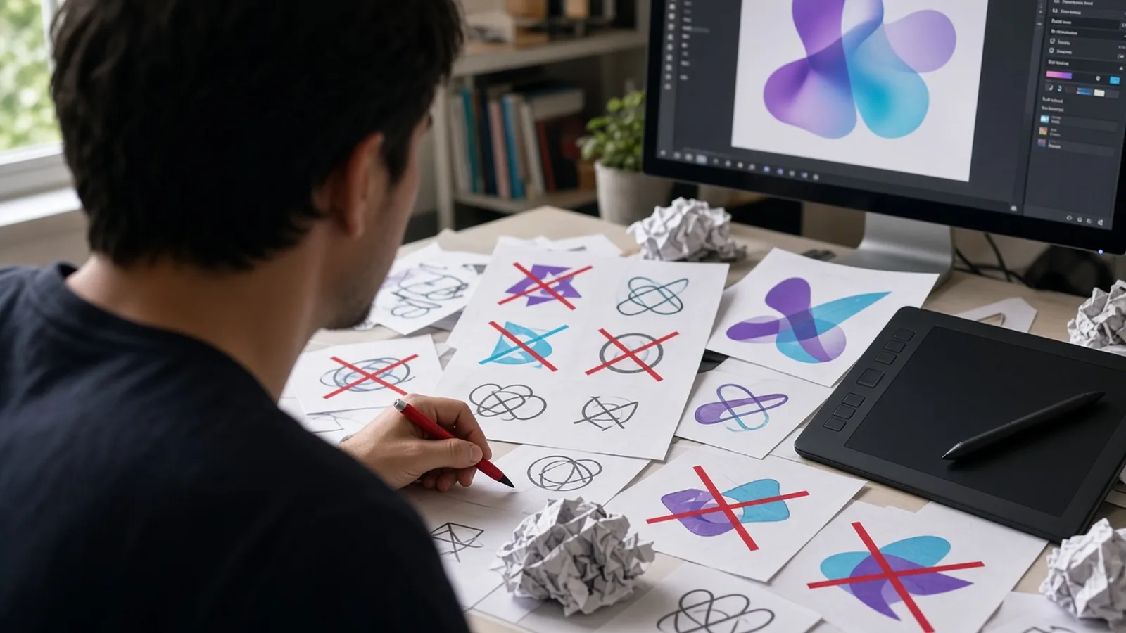
Your logo appears everywhere: on your Instagram profile, delivery bags, invoices, signage, website, and even the tiny icon in a browser tab. That is why logo design mistakes are so costly. A weak logo can make a good business look amateur, and fixing it later means reprinting materials and confusing customers who already know you.
Here are twelve common mistakes that show up again and again with businesses in Kuwait and the Gulf, and what to do instead.
1. Starting Without a Brief
Many logos fail before design begins, because nobody defined the audience, personality, or positioning. “Make it modern and nice” is not a brief.
Instead: write down who your customers are, what makes you different, three words that describe your brand personality, and where the logo will be used most. A short brief guides better design decisions. The guide to branding for startups in Kuwait explains how to prepare one.
2. Making It Too Complex
Detailed illustrations, multiple symbols, gradients, and fine lines may look impressive on a big screen, but they turn into a blur on a phone or an embroidered uniform.
Instead: aim for a simple, distinctive shape. Ask: could someone sketch it from memory after seeing it once?
3. Ignoring Small Sizes

Your logo will often be displayed as a small circle on social media or a favicon. If it only works at large sizes, it fails where people see it most.
Instead: design a compact version or symbol that works at small sizes, and test it early inside a circular profile frame.
4. Poor Arabic Lettering
Arabic logos are a craft of their own. Common problems include letters that are stretched unnaturally, broken connections, unreadable calligraphy, or an Arabic version that looks unrelated to the English one.
Instead: work with a designer experienced in Arabic typography. The Arabic and English versions should feel like siblings: similar weight, rhythm, and personality, while each remains natural in its own script.
5. Following Trends Blindly
Trendy effects, such as heavy gradients, glitch styles, or a particular font everyone is using this year, can make a logo feel dated quickly.
Instead: use trends lightly in your marketing materials, but keep the logo itself timeless. You can refresh campaigns every season; you should not have to change your logo every two years.
6. Copying Competitors or Famous Brands
Taking inspiration is normal. Copying is risky, both legally and commercially. A logo that resembles a competitor’s makes you look like a follower, and customers may confuse the two.
Instead: research competitors to understand what to avoid, and look for a visual direction that is clearly yours.
7. Relying on Colour to Do All the Work
If a logo only works in its full colour version, it will struggle on dark backgrounds, single-colour printing, engraving, or embroidery.
Instead: make sure the logo works in one colour, black, and white first. Then add colour as an enhancement.
Need a brand identity and logo that make your business stand out?
8. Choosing the Wrong Font
Default fonts, overly decorative scripts, or fonts without proper Arabic support can weaken a logo, and some fonts are not licensed for commercial use.
Instead: choose or customise lettering that matches your personality and is legally licensed for logo use. Often the best logos involve custom adjustments to letters so they feel unique.
9. Too Many Concepts, Too Many Opinions
Showing a new logo to every relative and friend often leads to a compromise that pleases nobody. Personal colour preferences can override strategic choices.
Instead: judge concepts against your brief and target audience, not personal taste. Get feedback from a few people who represent your customers.
10. Receiving the Wrong Files

A single low-resolution JPG is not a logo package. Without proper files, printers, sign makers, and web developers will struggle.
Instead: make sure you receive:
- Vector files (SVG, PDF, or EPS/AI) for scaling without quality loss.
- PNG files with transparent backgrounds for digital use.
- Colour, black, and white versions.
- Horizontal, stacked, and icon-only versions where relevant.
- Colour codes (HEX, RGB, CMYK) and font names.
11. Not Thinking About Real Applications
A logo that looks great on a white presentation slide may not fit a wide shop sign, a square Instagram profile, or a small product label.
Instead: test the logo on realistic mockups: storefront, packaging, website header, social profile, and business card, before final approval.
12. Skipping Simple Usage Rules
Even a great logo can be ruined by stretching, wrong colours, or placing it on busy photos.
Instead: create a one-page usage guide: minimum size, clear space around the logo, approved colour versions, and examples of what not to do. Share it with everyone who creates content for you.
Signs Your Current Logo Needs a Refresh
- It is hard to read on Instagram or as an app icon.
- You use several different versions without a clear system.
- The Arabic and English versions do not look connected.
- It no longer reflects your quality, prices, or audience.
- You do not have the original vector files.
A refresh does not always mean starting over. Sometimes simplifying, adjusting the lettering, or creating a compact version is enough to keep your recognition while looking more professional. The same thinking applies to websites; see signs your website needs a redesign.
What a Professional Logo Process Usually Looks Like
- Discovery: questions about your business, audience, and goals.
- Research: competitors, market, and visual references.
- Concepts: a few distinct directions, presented with real-life mockups.
- Refinement: improving the chosen direction based on feedback.
- Finalisation: all variations, colour versions, and file formats.
- Guidelines: simple rules for consistent use.
When comparing designers, ask how they handle each step. The checklist in how to choose a web designer in Kuwait works for branding designers too.
Frequently Asked Questions
How much does logo design cost in Kuwait?
Logo design typically ranges from around 80 KWD to a few hundred dinars depending on research, number of concepts, Arabic/English versions, and deliverables. A full visual identity costs more. Contact us for a quote based on your needs.
What files should I receive for my logo?
At minimum: vector files (SVG, PDF, or AI/EPS), transparent PNG files, colour, black, and white versions, and the colour codes and font names used.
Should my logo include both Arabic and English?
If your customers speak both languages, it often helps to have both versions or a symbol that works with either. The right setup depends on your name, audience, and where the logo appears.
Can I use a free online logo maker?
It can be a quick temporary solution, but such logos are often generic, similar to others, and may have limited usage rights. For a long-term business, a custom logo is usually worth it.
Related HaZeM Design services: Logo design, Print design, Packaging design.
Need a Logo That Works Everywhere?
We design logos and visual identities for businesses in Kuwait and the GCC, with properly crafted Arabic and English versions and all the files you need. Send us your business name and a short description on WhatsApp at +965 50647346 to get started. You can also see branding work and the branding package.
We serve businesses across Kuwait and the GCC — see also: Web design in Bahrain, all areas we serve.